Writing and WYSIWYG text editors. Medium vs CKEditor
I was reading Robby Inebretsen’s post “Markdown is the future of writing” when I came to the following realization: I despise CKEditor and all similar WYSIWYG editors.
No, I don’t just dislike them. It’s an angrier feeling. They annoy me to no end. 99.5% of the time I immediately hit the View Source button so I don’t have to deal with them. I’m always glad to be in HTML-land.
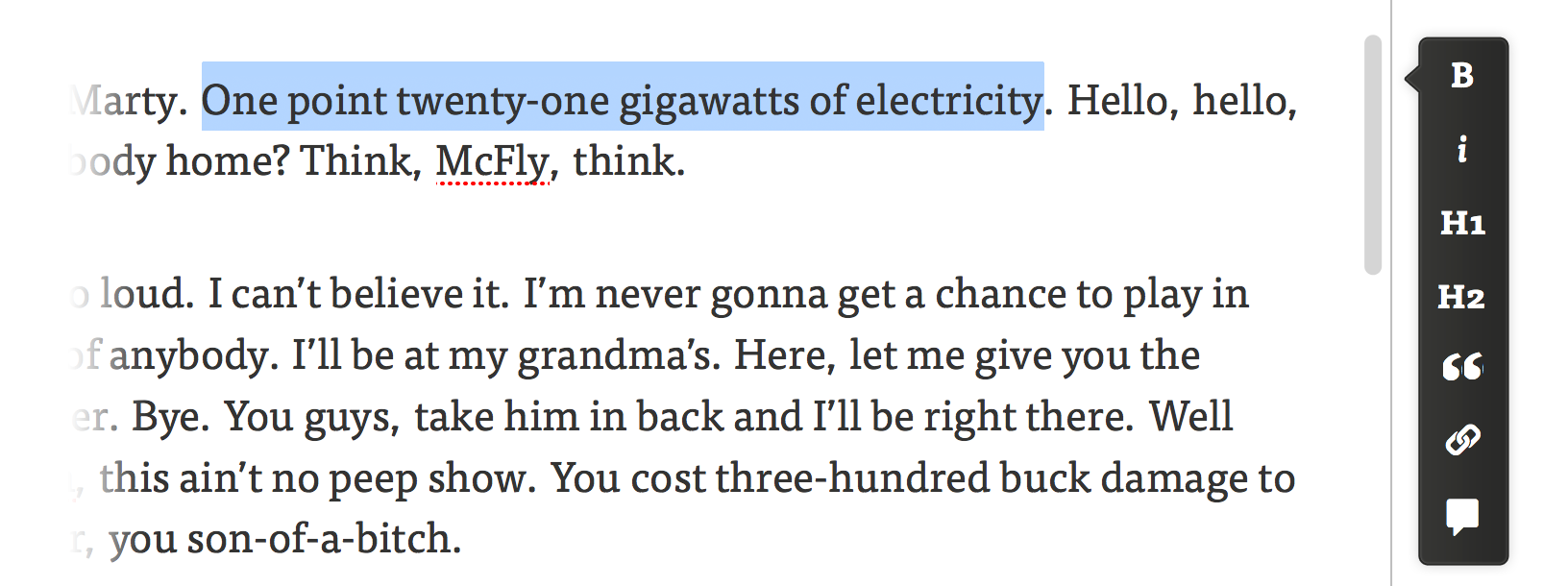
Robby writes about how most people are not yet ready for working with raw Markdown, and how the guys at Medium came to a solution that works for them and makes it really easy to format posts. I have to give them kudos: Medium’s toolbar is a marked improvement over most WYSIWYG editors out there. There is no stupid top bar that makes you scroll up whenever you need it. There’s not a hundred buttons you never use. Why do most editors look like MS Word? Their interface is clunky, outdated and doesn’t work well in a web browser.

Medium’s solution is very much in line with the recent crop of minimal and distraction-free text editors that let you focus on the content rather than the formatting. It’s useful and elegant. It’s concise and to the point. You select some text and a small set of actions pop-up. It’s (almost) perfect for them, but sadly, it doesn’t work in most situations.
A general solution needs to be good for shorter pieces of writing, to be used on pages where there are more fields to fill or actions to complete. It needs to suit any situation where you’d need a text area — no matter how big — and basic formatting of the input. It should also require no guesswork from less tech-savvy users.
I think the solution is quite simple actually. Don’t hide the toolbar. But don’t place it at the top of the textarea either. Make it sticky. Even better, make it a sticky sidebar.

That way it doesn’t matter if you scroll or if the textarea is really tall: the sidebar is always there when needed. You don’t present the user with a blank field and depend on him triggering the toolbar. It’s obvious from the get go. You don’t use (scarcer) vertical screen space. You don’t need the user to know Markdown or HTML. The only drawback I can see is that you can’t include too many options or else the menu becomes too tall, but you shouldn’t be doing that anyway.
Split view editors with live preview like Mou or the one Ghost uses also seemed like a good idea to me at first, but they take more space and they distract from the actual writing making you think about syntax. WYSIWYG with a sticky sidebar is the way to go.
On a personal project I’m working on my plan is to implement all this. Text areas will have a sticky sidebar (using jQuery. Browser support for CSS3’s ‘position:sticky’ property is awful at the moment), it will work for both Markdown and HTML content — the project requires it — and there will be a View Source button. Better safe than sorry.
Once I get it working I might turn it into a jQuery plugin or something. But if you beat me to it, please let me know. For the sake of efficiency.
